Cesar Gomez, Senior Product Designer
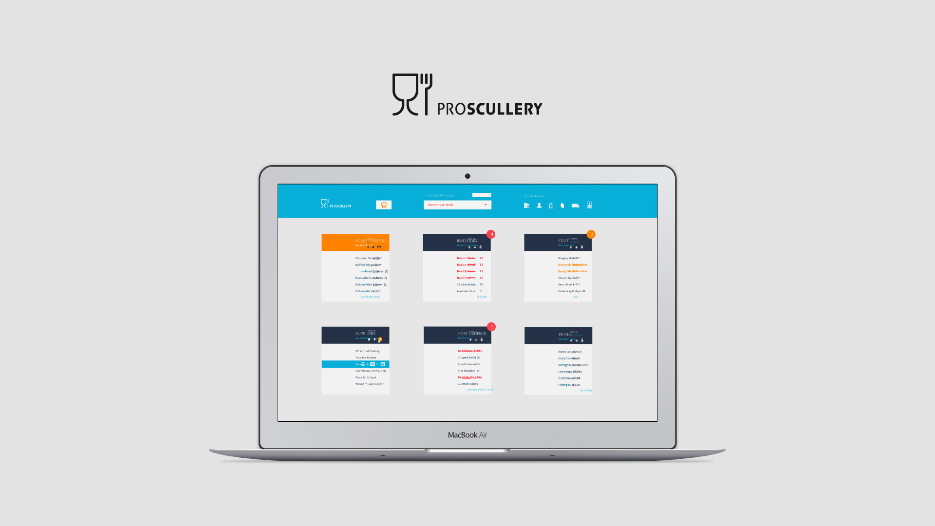
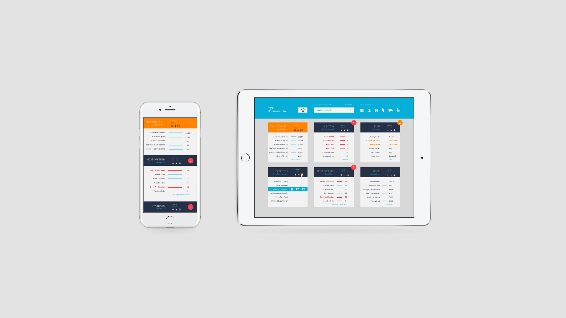
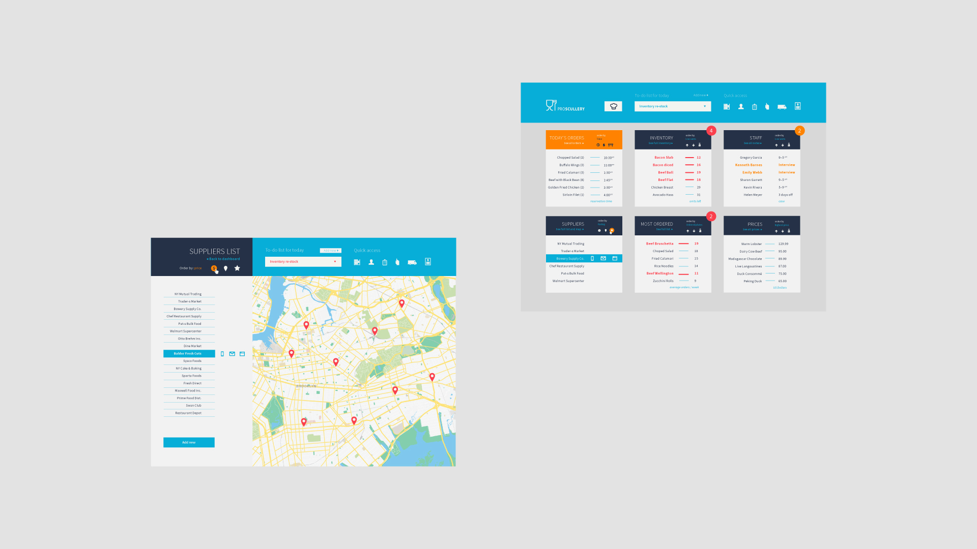
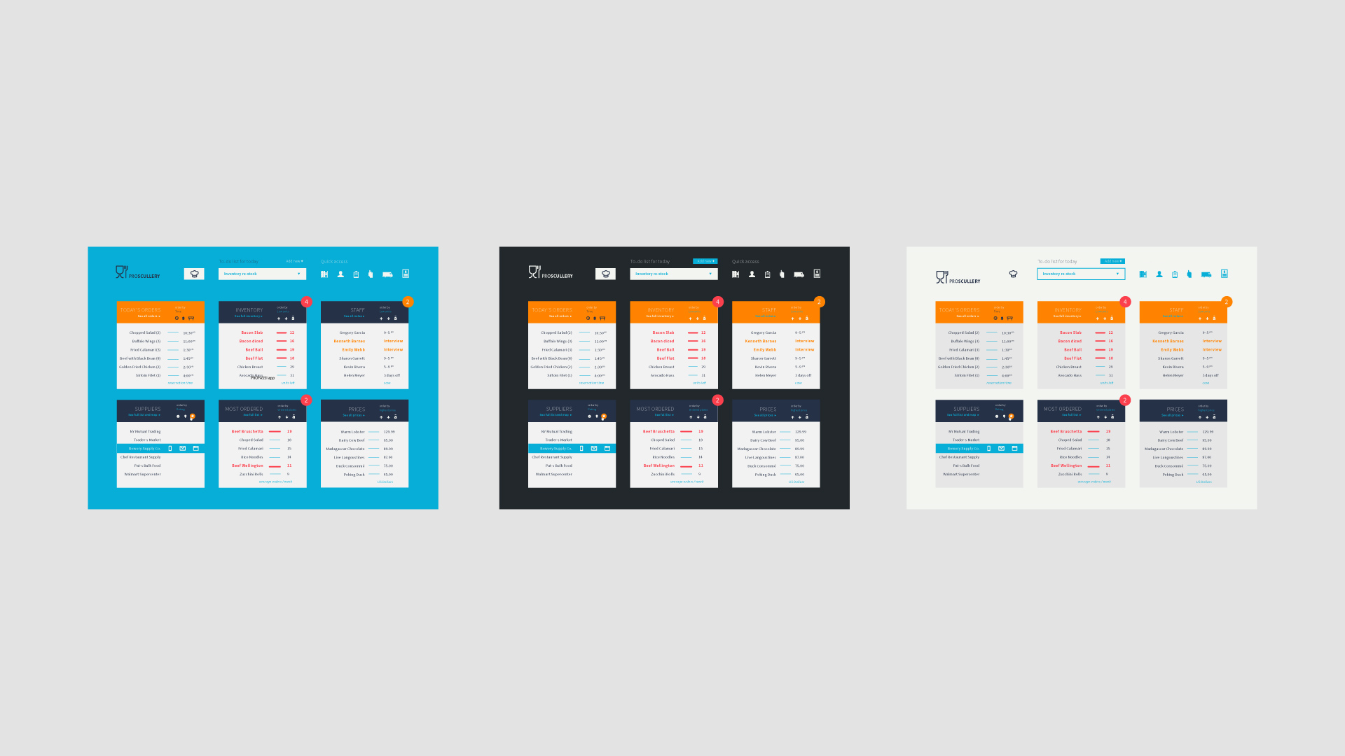
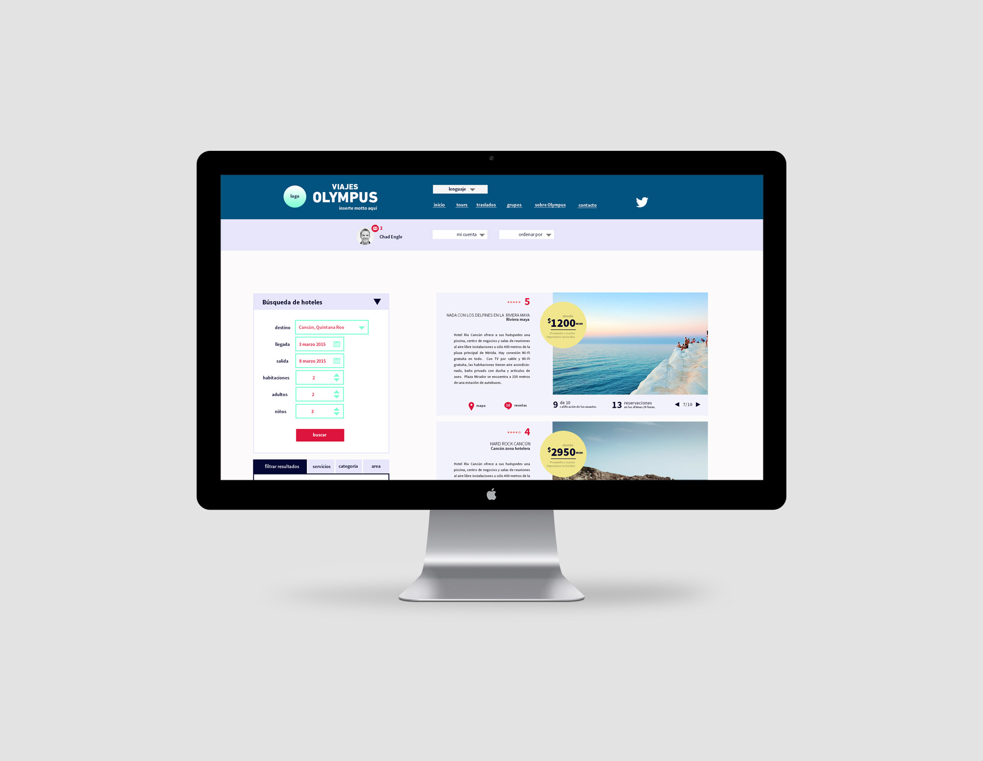
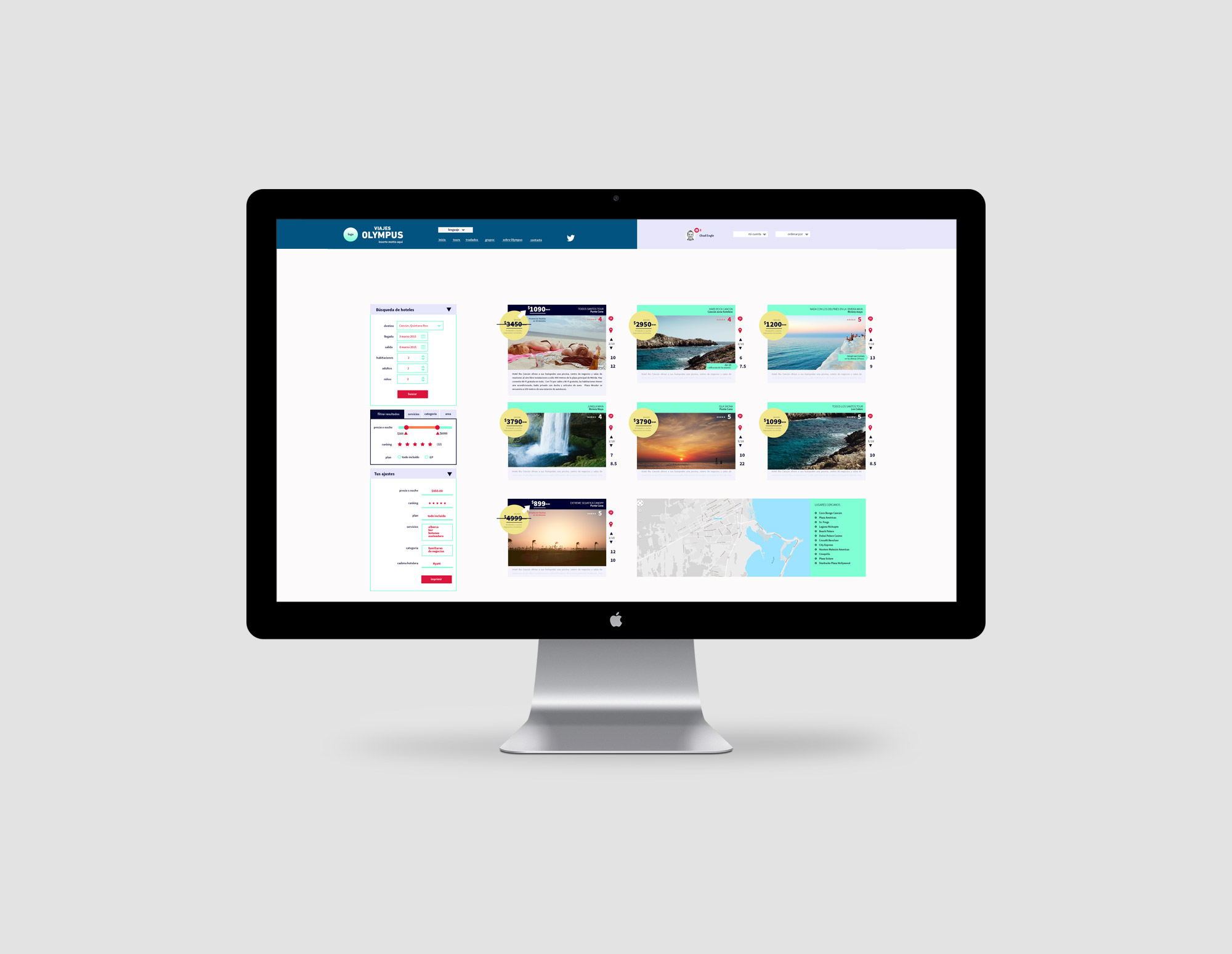
Greetings! I'm Cesar, a Senior Product Designer engaged in the world of enterprise software since 2010. My expertise covers the entire design lifecycle, cohesively integrating UX and UI workflows. I specialize in creating design strategies, frameworks, documentation, and guidelines. I design intuitive and engaging user experiences for large-scale SaaS, B2B, B2C, desktop, mobile & AI applications.
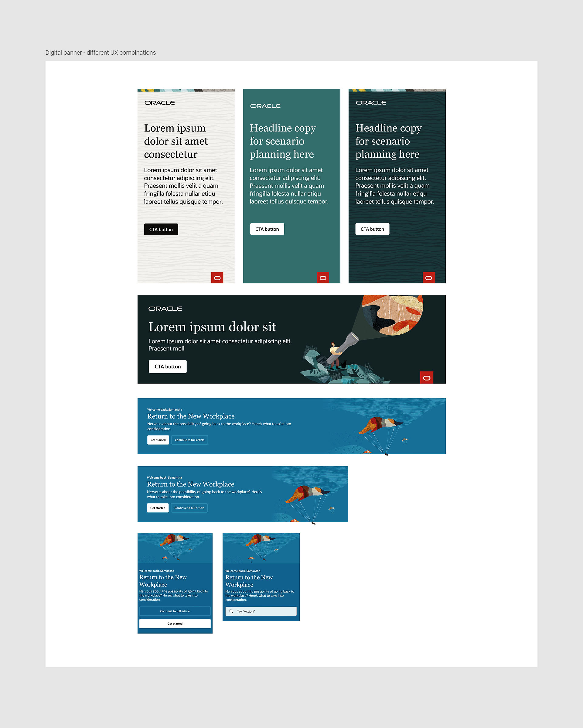
As a 'full-stack product designer' I've extensive experience in HTML, CSS, and Javascript, which I use mainly to prototype, test and preview conceptual ideas. I easily collaborate with developers, other teams and stakeholders, ensuring a smooth process of design → development → iteration. Some skills I use to achieve the best possible solutions include: ideation, planning, user flows, wireframes, prototypes (both, Figma and code), testing, and iterative refinement.
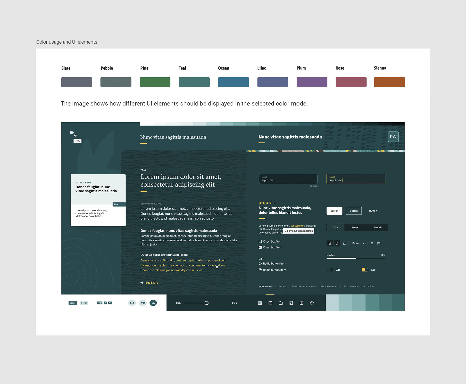
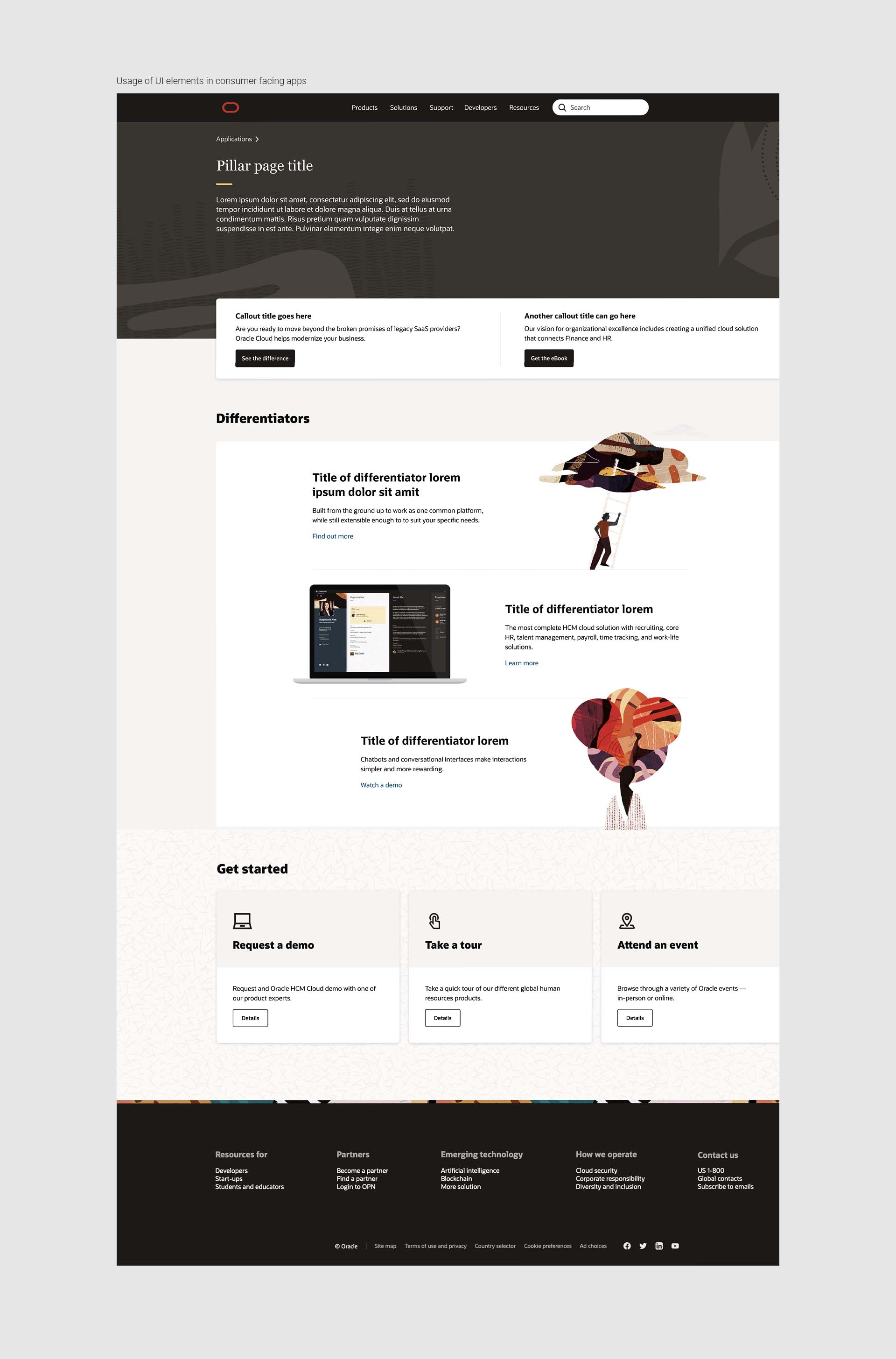
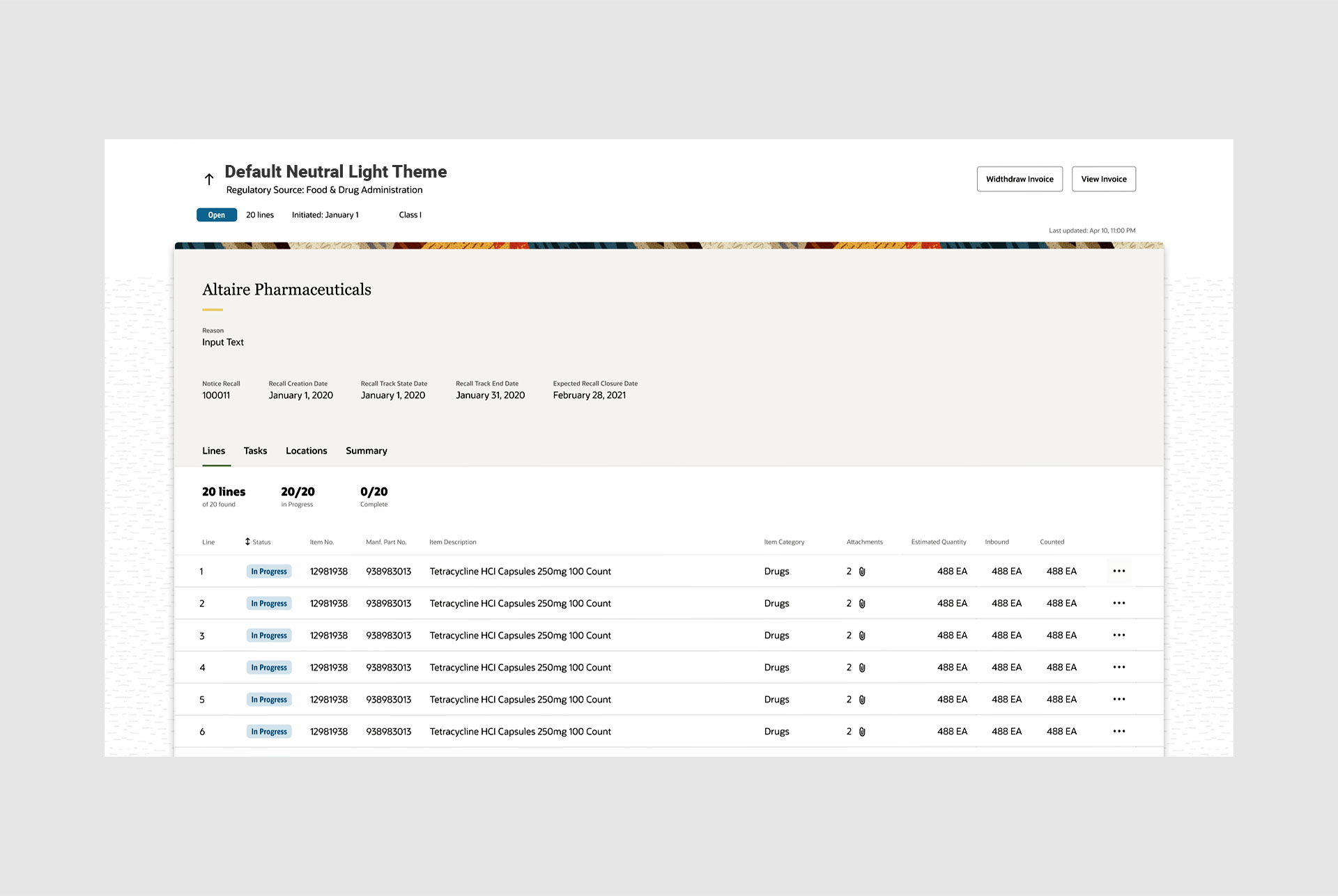
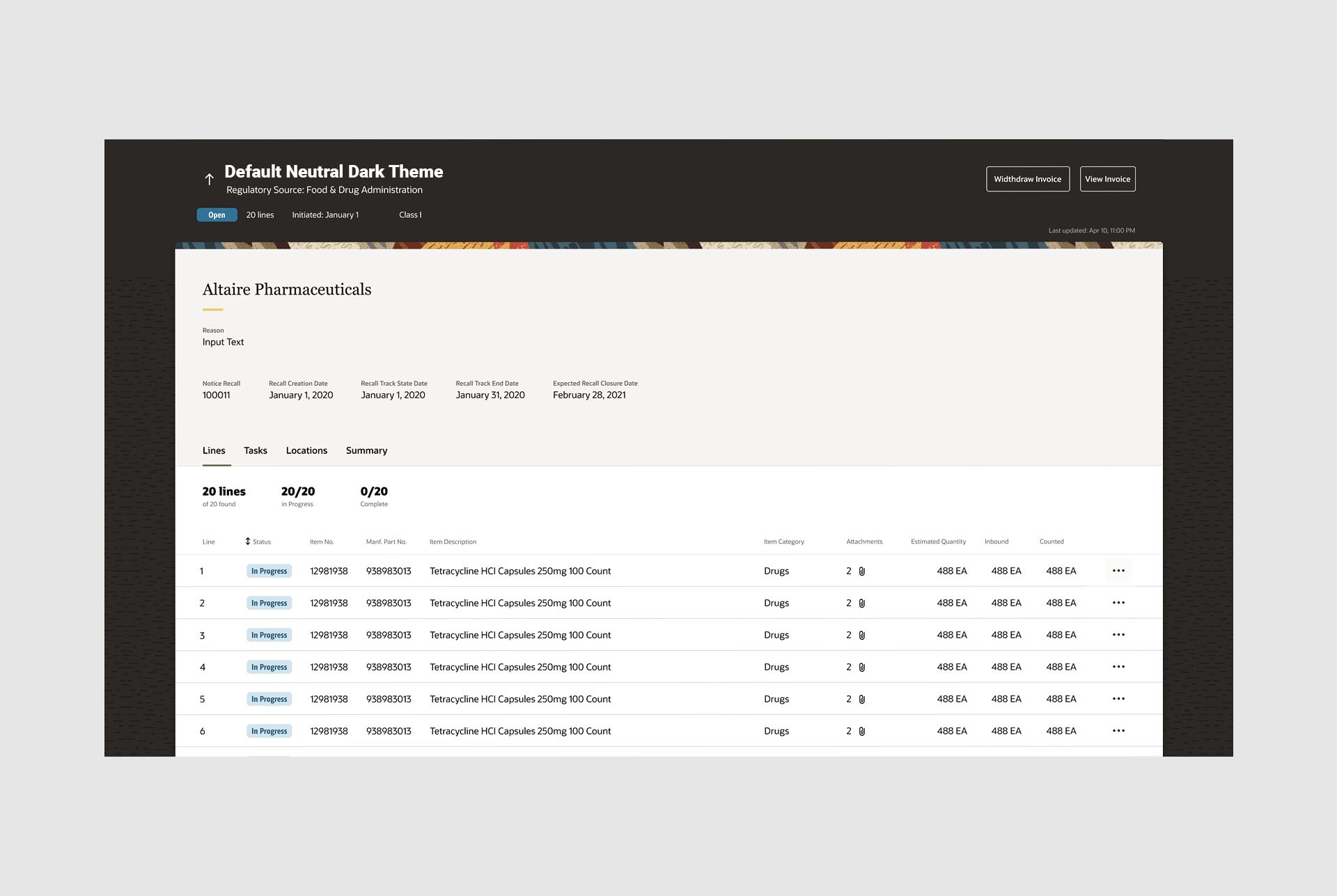
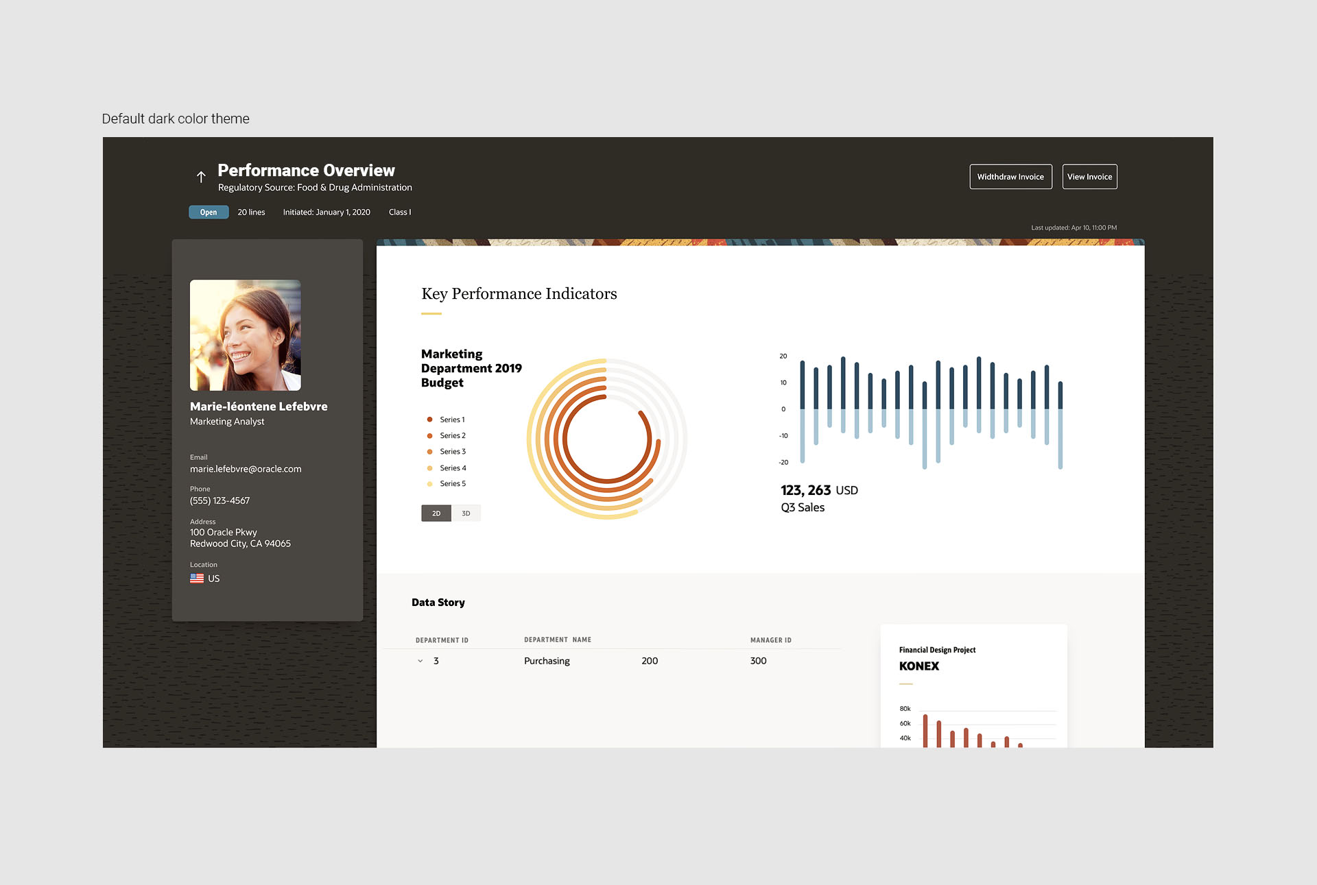
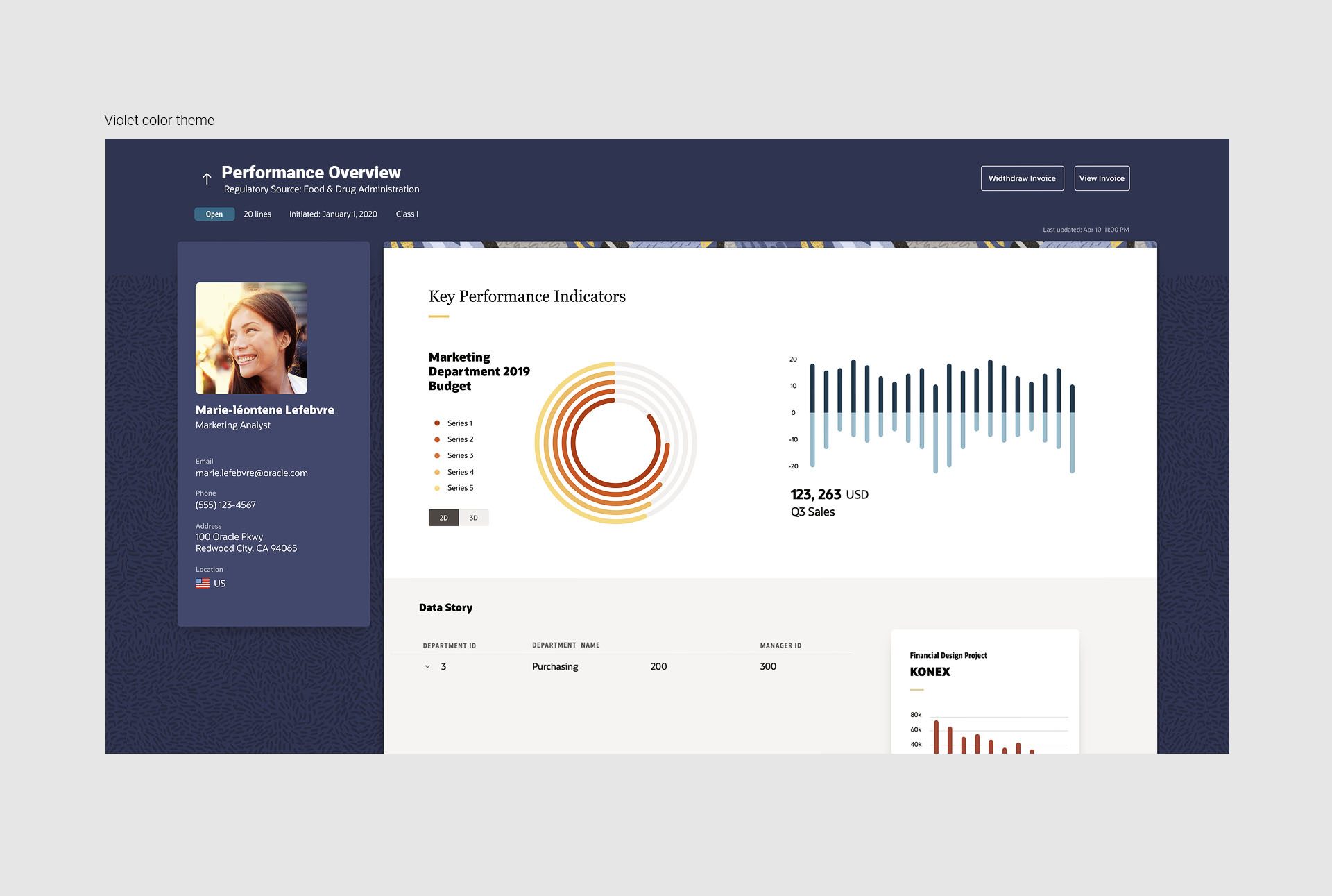
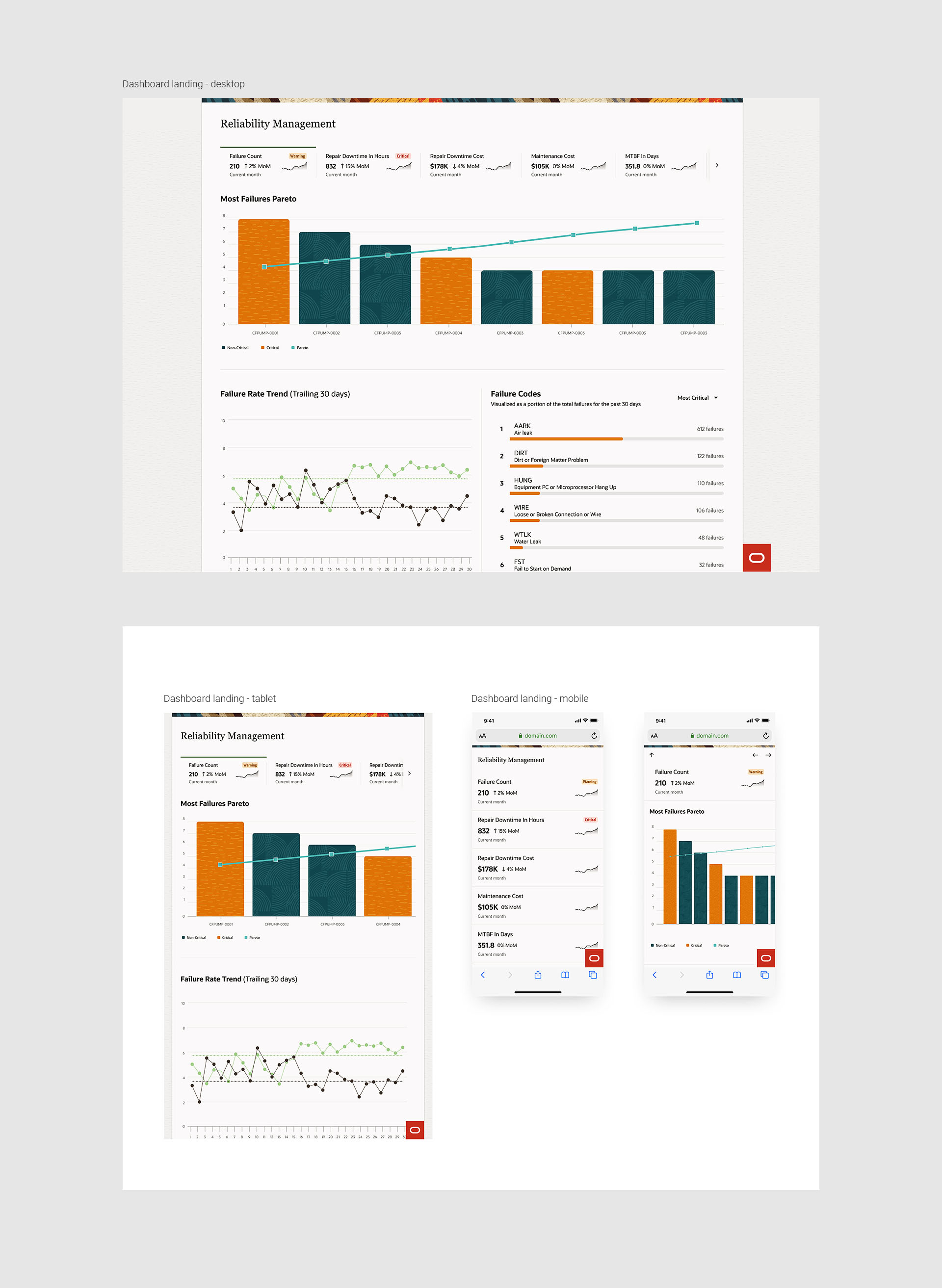
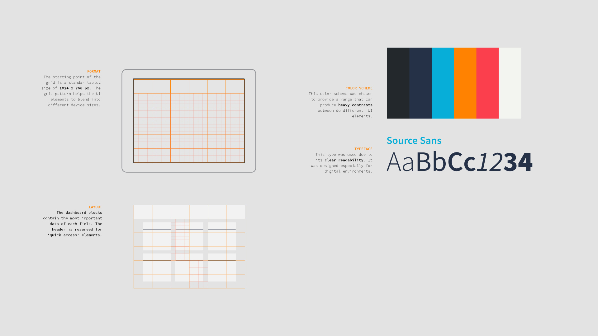
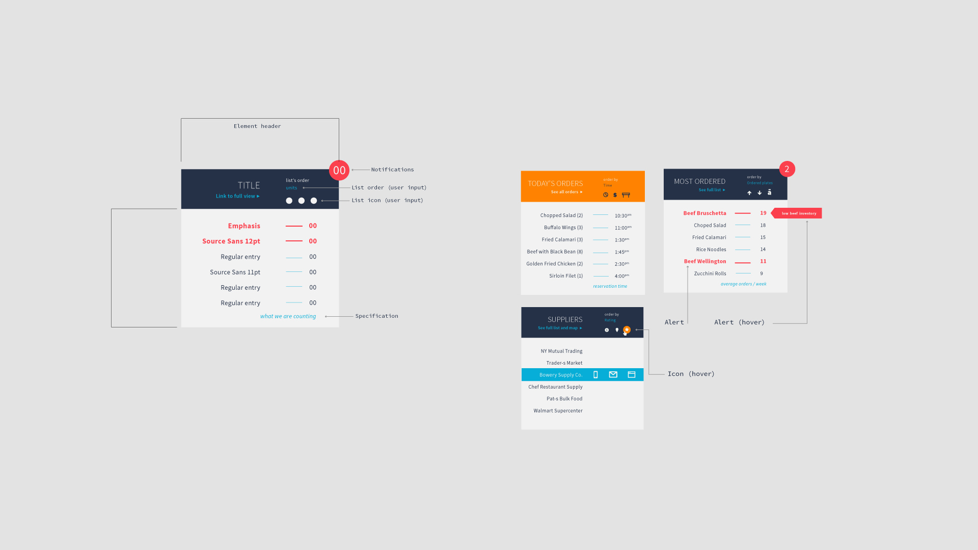
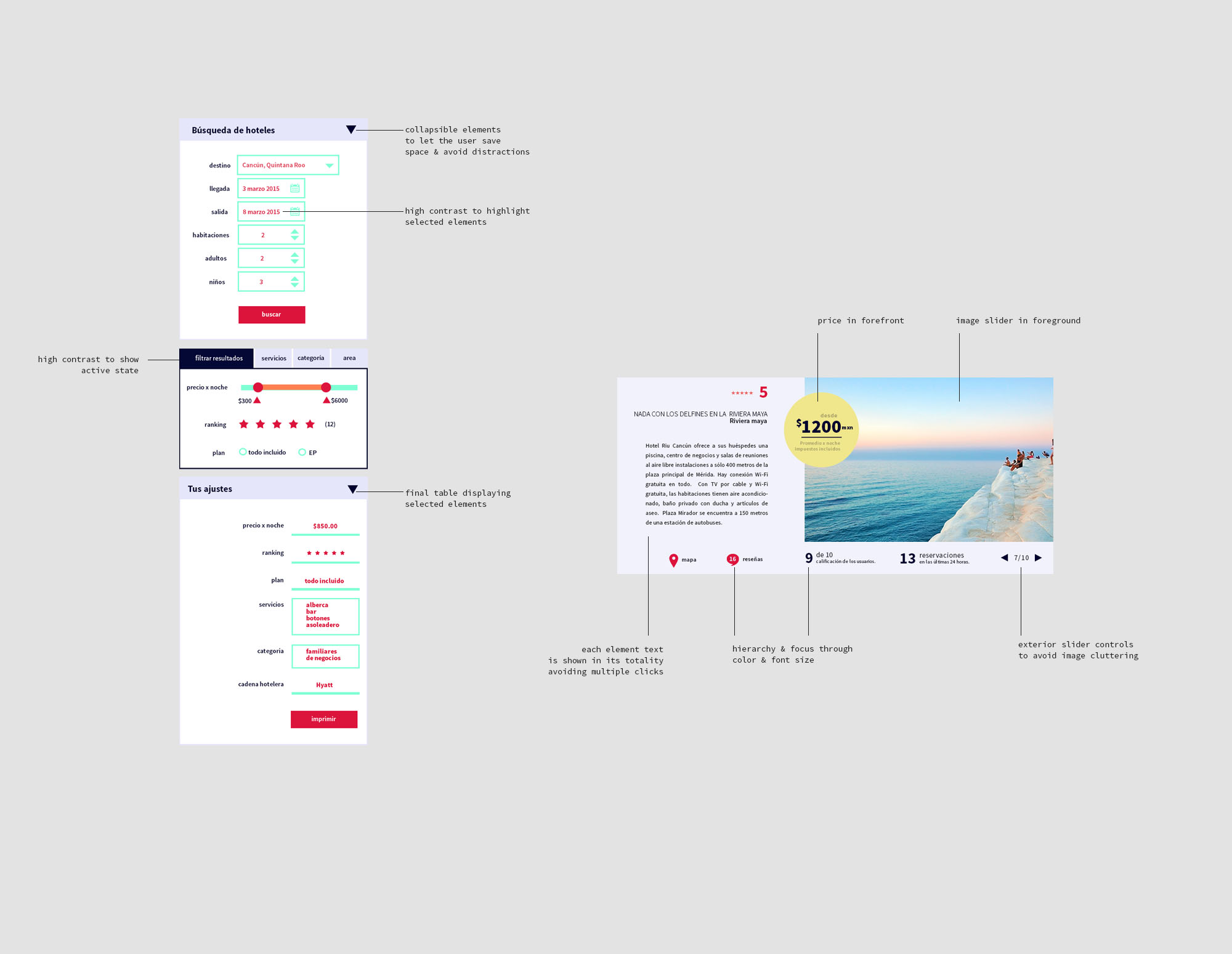
In my everyday work, I apply the foundations of user-centered design: visual appeal & harmony, interactivity, hierarchy; web standards and accessibility, reusable components, atomic design, documentation of technical specs & usability guides...
Let's bring your vision to life through thoughtful design!
![oracle: color usage and UI elements](images/oracle-1.jpg)
![oracle: consumer facing app example](images/oracle-2.jpg)
![oracle: interface light theme with tabular data](images/oracle-3a.jpg)
![oracle: interface dark theme with tabular data](images/oracle-3b.jpg)
![oracle: default dark color theme for HR app](images/oracle-4a.jpg)
![oracle: default light theme for HR app](images/oracle-4b.jpg)
![oracle: custom violet theme for HR app](images/oracle-4c.jpg)
![oracle: dashboard landing: desktop, tablet & mobile versions](images/oracle-5.jpg)
![oracle: digital banner: horizontal & vertical](images/oracle-6.jpg)
![oracle: sizes & breakpoints for different components](images/oracle-7.jpg)
![oracle: page header component: create & edit](images/oracle-9.jpg)
![oracle: diagram nodes examples](images/oracle-10.jpg)
![oracle: image card with different size versions and documentation example](images/oracle-11.jpg)
![ProScullery: digital app main screen](images/scullery-1.jpg)
![ProScullery: example of grids, text and color](images/scullery-2.jpg)
![ProScullery: exaple of definition of hierarchies in the main component](images/scullery-3.jpg)
![ProScullery: example of app in mobile and tablet devices](images/scullery-4.jpg)
![ProScullery: example of main screen and map section](images/scullery-5.jpg)
![ProScullery: example of different color schemes](images/scullery-6.jpg)
![main screen](images/olympus-1.jpg)
![different layout for big screens](images/olympus-3.jpg)
![definition of UI elements and documentation](images/olympus-4.jpg)
![app main screen with custom made logo](images/marcaminos-1.jpg)
![definition of logotype](images/marcaminos-2.jpg)
![logotype among its mobile icon application](images/marcaminos-3.jpg)
![book cover](images/dvg-1-cover.jpg)
![book covers](images/dvg-2-books.jpg)
![book from back](images/dvg-3-books.jpg)
![different posters](images/dvg-17-poster.jpg)
![book pictograms](images/dvg-4-books.jpg)
![presentation cards with info and pictograms](images/dvg-5-cards.jpg)
![presentation cards from back with illustrations](images/dvg-6-cards.jpg)
![posters close-up](images/dvg-19-poster.jpg)
![postcards view with photo and data](images/dvg-8-postcard.jpg)
![poster close-up](images/dvg-13-poster.jpg)
![printed envelopes for mail](images/dvg-7-envelope.jpg)
![application to CD with info and pictograms](images/dvg-9-cd.jpg)
![simple poster](images/dvg-10-poster.jpg)
![cups and physical surface application](images/dvg-12-cups.jpg)
![print pictograms](images/dvg-18-poster.jpg)
![posters: thw two versions side by side](images/dvg-11-poster.jpg)
![pictograms close-up in printed media](images/dvg-20-poster2.jpg)
![UX design & UI development](images/dvg-web-preview4.jpg)
![text elements and custom logotype](images/dvg-web-preview.jpg)
![main screen in tablet size](images/dvg-web-preview2.jpg)
![gif showing the design process and layout of the elements](images/website-grid.gif)
![animation of a pictogram](images/vera.gif)
![animation of simple elements used widely](images/rainning.gif)
![main logotype](images/roshfrans1.jpg)
![design elements like color, text and different logo applications](images/roshfrans2.jpg)
![3D rendering of application in sale products](images/roshfrans3.jpg)
![label main application on bottle](images/cuervo1.jpg)
![label view without bottle in flat and curved versions](images/cuervo2.jpg)
![label view with grid and proportions and individual elements](images/cuervo3.jpg)
![moodboard](images/cuervo4.jpg)
![label view in color](images/cuervo5.jpg)
![label close-up showing details](images/cuervo6.jpg)
![3D render of bottle with label in front view](images/cuervo7.jpg)
![3D render close-up with transparent bottle application](images/cuervo8.jpg)
![3D render of label with no elements](images/cuervo9.jpg)
![elements close-up](images/cuervo10.jpg)
![cover](images/typebook_1.jpg)
![fold showing pages of typefaces](images/typebook_2.jpg)
![typeface elements](images/typebook_3.jpg)
![heraldic and its lines meanings](images/typebook_4.jpg)
![fold showing text and some illustrations](images/typebook_5.jpg)
![close-up of some illustrations](images/typebook_6.jpg)
![close-up of a fold with some historic background](images/typebook_7.jpg)
![fold of the art noveau section](images/typebook_8.jpg)
![close-up of the art noveau section](images/typebook_9.jpg)